Adjust Your Website for Mobile, Tablet, and Desktop Views
Cardsetter gives admins the ability to control their website for each screen view - mobile, tablet, and desktop.
Not only can you adjust the size of content blocks within your page for each screen view, you can adjust the order of blocks within grids and decks.
Use the screen view selections at the top of your admin screen to preview what your site will look like on various devices, and to make adjustments for each. You can quickly switch between mobile, tablet, and desktop views.
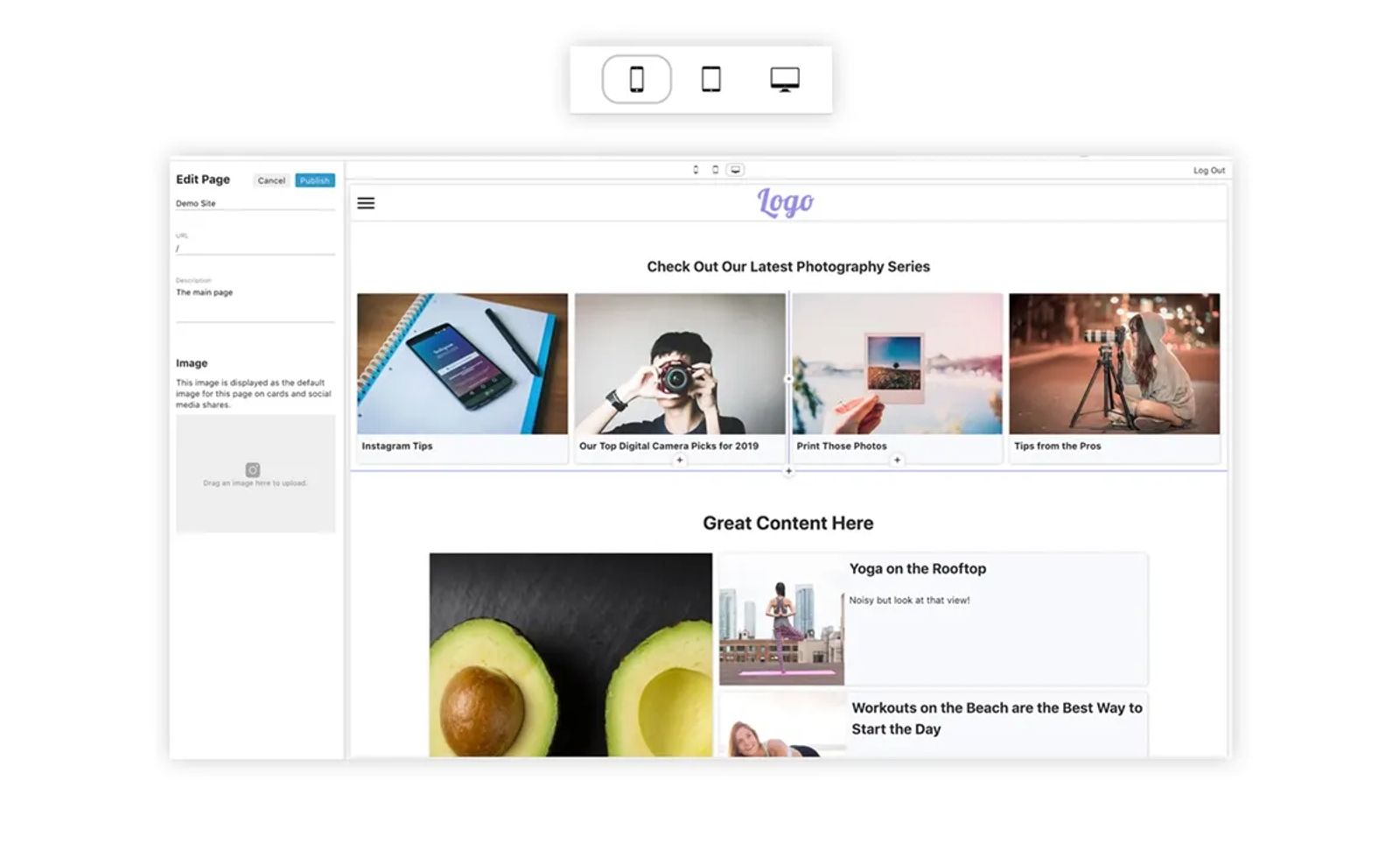
While in a specific view, the adjustments you make to block sizes on the page will only take effect in the view you have selected during editing.
Click on the view that you'd like to make adjustments to at the top of your screen. (Give the icon a double click to change the orientation of the device to landscape. Double click again to go back to portrait.)
To resize blocks within your page - cards, text blocks, image blocks, and code blocks - hover over a corner or edge of the block. Then, drag the edge to the size and orientation that you'd like the block to be for that screen view.
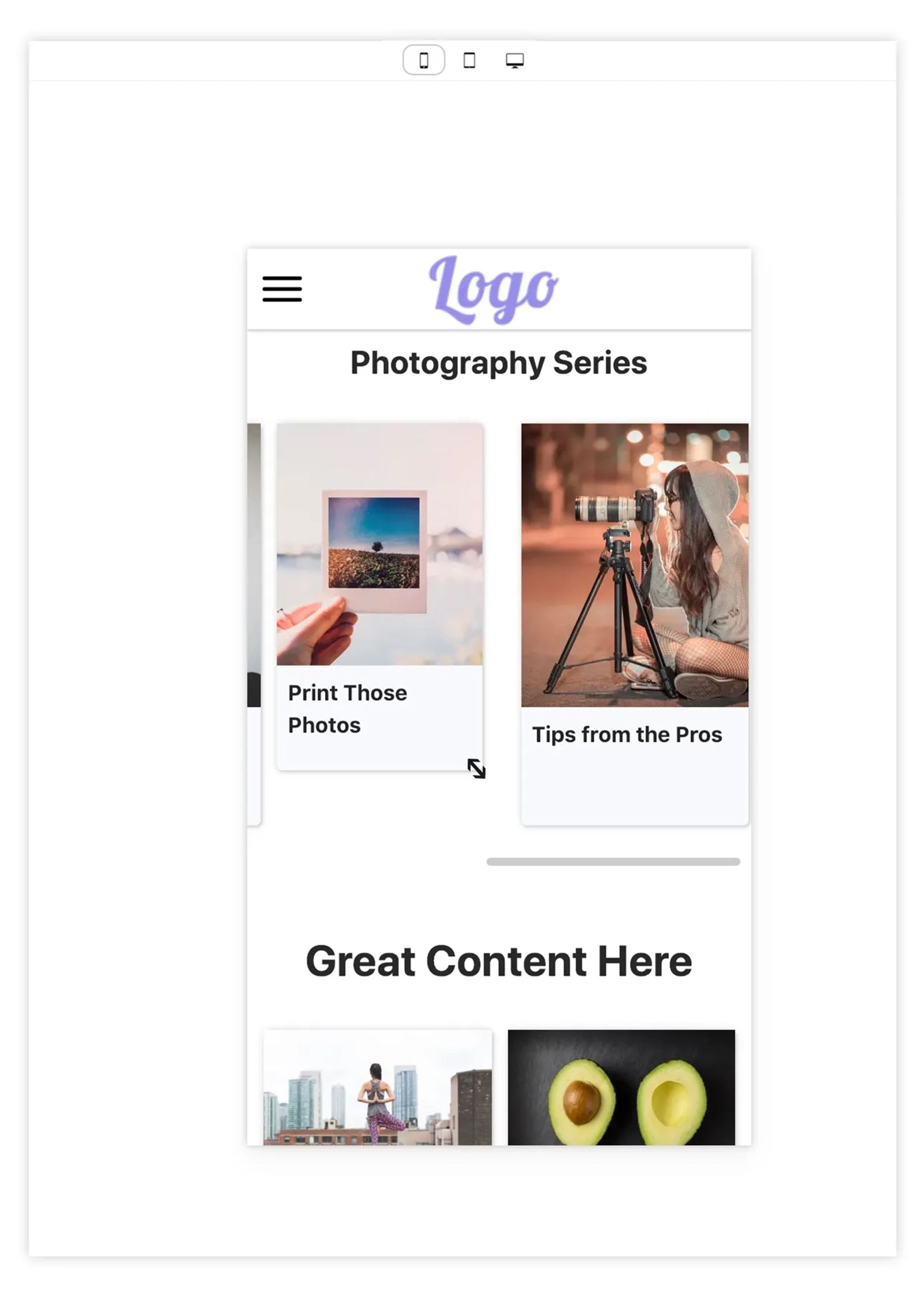
You can also re-order blocks that are within grids and decks on the page, specific to each screen view.
Click on the view that you'd like to make adjustments to at the top of your screen.
To re-order blocks within a grid or deck specific to the view, simply drag and drop the content to where you'd like it to appear for that screen view.
Remember that over 60% of online traffic comes from mobile devices these days. It's especially important to make sure your audience has an optimal mobile experience!