
Examples of effective websites
Jessica Baldwin / Published September 5, 2022
What makes a website effective? While there's no "one-size-fits-all" approach to website design and strategy, successful websites share a few common characteristics.
Effective websites:
Speak to the ideal customer
Effective websites have a well-defined ideal customer persona. Every website element–the text and headlines, design, and imagery–is chosen with the ideal customer in mind. Organizations that "understand their customer" better communicate with their target audience.
Learn how to define your ideal customer.
Communicate benefits and solutions
Your ideal customer has a specific problem or need your company can solve. Successful websites communicate the benefits they'll realize by choosing your business over alternatives.
Here's how to write a compelling key benefit statement.
Have a clear call to action
A call to action is a word or short statement that tells your visitors what to do. Usually, the primary call to action helps your visitor take the first step to become your customer. Common website calls to action include "shop now," "sign up," "join," "request a quote," "buy now," "call us," "book now," "subscribe," and more. Effective websites include a clear call to action and guide visitors to take that action.
Learn more about creating a call to action for your website.
Provide the right messaging
Effective websites deliver the right message to visitors at the right time. They attract the ideal customer's attention with a professional design, quality copy, and engaging content. They provide adequate information to educate potential customers about products and services, address objections, and answer questions.
Check out our guide to effective website content.
Are functional
Websites must be functional. If visitors experience errors on the site, they will bounce and not return. Functional websites load quickly, are optimized for mobile devices, have intuitive navigation, and work properly. Visitors should never feel confused or frustrated as they travel through the website.
Are supported by a marketing strategy
The most effective websites have marketing strategies alongside them. A perfectly designed website won't be successful if no one visits it! Search engine optimization, social media marketing, content, online ads, and traditional advertising are a few ways to market your website once it's launched.
Here is a five-step guide to marketing your website.
Examples of effective websites
Is there a "perfect website?" No! But, we can draw inspiration by looking at what other websites are doing well.
Now that we know what makes an effective website, let's look at a few examples from several small businesses.
Britt Smart Security
Britt Smart Security offers home security and smart home installation services in Columbus and Medina, Ohio.
Ideal customer
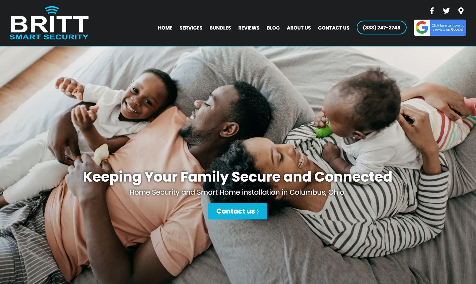
Britt Smart Security does a great job appealing to their ideal customer. The main headline says, "Keeping your family secure and connected." Clearly, homeowners with families are the target audience. Britt communicates to them not only with the headline on the page but with the adorable family photo at the top of the homepage.
Communicate benefits and solutions
Britt Smart Security reiterates the primary benefit of "keeping your family safe" throughout the headlines and text on the homepage. "Peace of mind" and "protect what matters most" are a couple of phrases used to do so. The website tells the audience that Britt Smart Security is a reputable company that's "been in business for over 20 years."
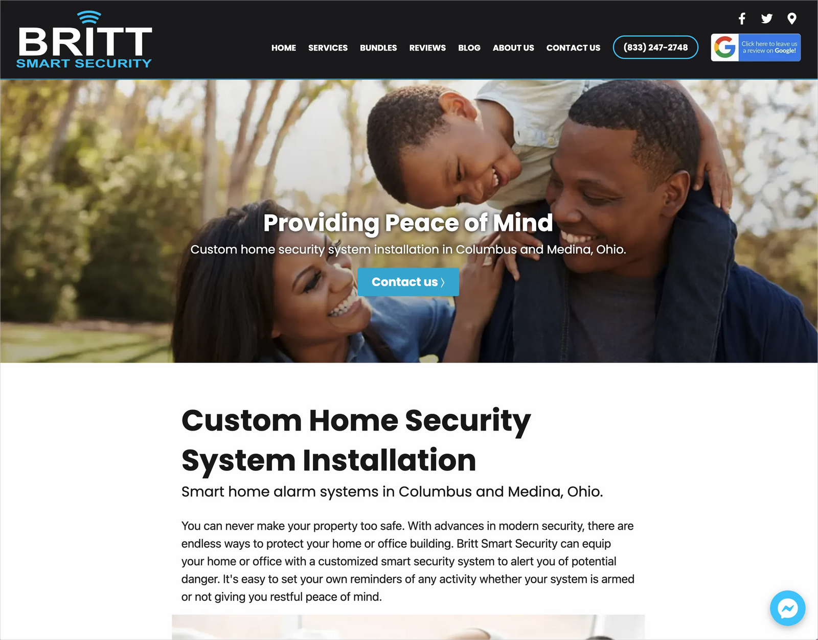
Each service page also communicates a benefit to the reader. For example, the "security systems" page headline says, "providing peace of mind."
Clear call to action
Britt Smart Security customizes home security and smart home solutions for each client. Therefore, communicating directly with the customer is necessary. The website includes a simple but straightforward call to action, "contact us." Britt Smart Security offers several contact methods so prospects can use their preferred method. Prospective customers can reach out by phone, contact form, or website chat via Facebook messenger.
The right messaging
The website does a good job appealing to the ideal customer with relevant, high-quality images, powerful headlines, and supporting copy. Britt Smart Security's website also includes informative content so potential customers can learn more about each service.
The reviews page contains testimonials from real customers to build trust with the reader.
Britt Smart Security also writes blog posts to help website visitors learn more and to improve its chances of showing up in search results.
The website appeals to website visitors at each stage of the customer journey–to those just becoming aware of Britt Smart Security and to people who want to learn more about home security and smart home services. It has a clear call to action for those ready to start.
Functional
Britt Smart Security's website loads quickly, has a responsive design for mobile devices, and all call-to-action buttons work. We didn't encounter any broken links or errors while navigating the website. It's easy for visitors to find relevant information and contact the company.
Marketing strategy
We don't have insight into Britt Smart Security's entire marketing strategy. However, we can assume that the blog content and detailed service descriptions help with the company's search engine optimization efforts. The company also has a well-optimized Google My Business listing with many reviews. The listing helps drive traffic to Britt Smart Security's website. Fortunately, we can see that they do have marketing activities supporting their website!
Parker's Hangover Tonic
Parker's Hangover Tonic is a craft caesar and bloody mary drink mix made in Montana.
Ideal customer
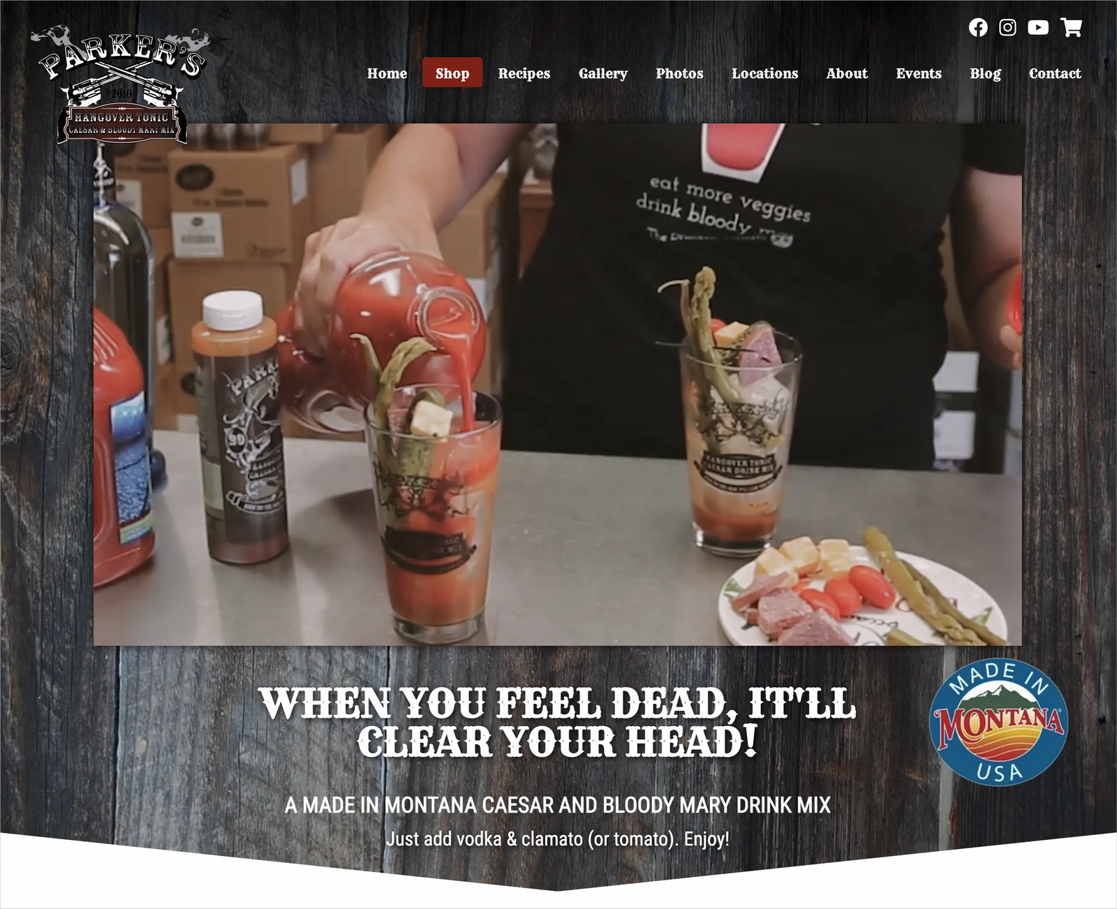
Parker's Hangover Tonic's ideal customer is the caesar or bloody mary enthusiast. The video on the top of the homepage depicts delicious-looking bloody mary and caesar drinks. It also shows how easy it is to make them yourself at home. The headline "when you feel dead, it'll clear your head" is playful and acknowledges that these drinks are often made for brunch after you may have enjoyed a night out.
Communicate benefits and solutions
The primary benefit of Parker's Hangover Tonic is just how easy it makes it to create a perfect cocktail at home. Parker's tells its readers how easy it is to make a great caesar or bloody mary drink on their own. It says, "just add vodka & clamato (or tomato). Enjoy!" The video reiterates that ease while also making the resulting drinks look appetizing.
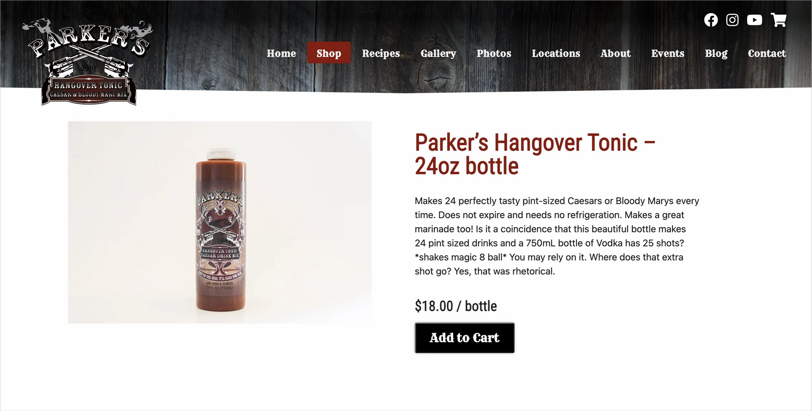
The product description includes additional benefits–"does not expire and needs no refrigeration," makes a great marinade too," and "makes 24 perfectly tasty pint-sized drinks."
Clear call to action
Parker's directs its website visitors to "shop." Visitors can order the tonic online and have it delivered right to their homes. The call to action appears as a button in the menu. As you scroll down the homepage, Parker's showcases product categories, followed by another "shop button."
The right messaging
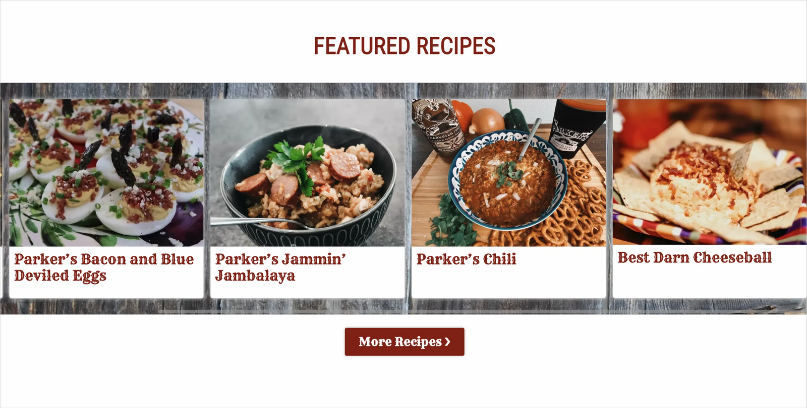
Parker's grabs the attention of its ideal audience with an engaging video and clever headline. Facebook reviews are embedded on the homepage so visitors can see what existing customers think of the product. The company also creates recipe content to engage its visitors. Readers learn that Parker's Hangover Tonic can also be used in several dishes, extending the use of the product and helping customers try new things.
Functional
The website is easy for visitors to navigate and makes it easy to purchase the product. The site loads quickly and functions well on mobile devices. We didn't experience any broken links or errors when browsing the website.
Marketing strategy
Parker's uses social media to drive traffic and product sales to the website. The company is active on Facebook and Instagram. The website also performs well in search engines for the keyword "caesar drink mix" to generate traffic to the website. Parker's also attends trade and consumer shows throughout the year.
Cultural Finesse
Cultural Finesse is a business consultant that helps businesses succeed internationally.
Ideal customer
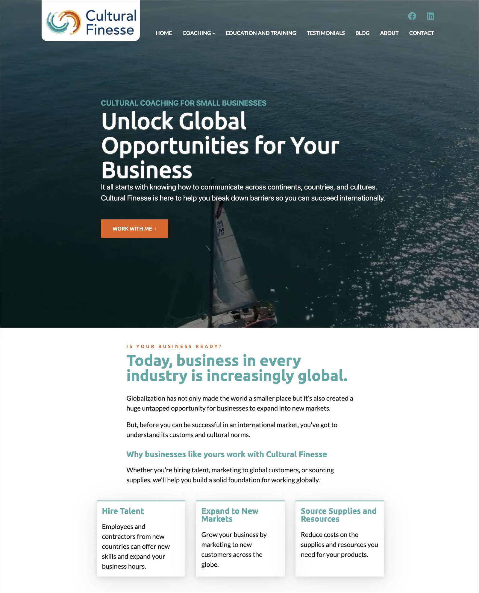
Cultural Finesse's ideal customer is businesses looking to expand sales, operations, or sourcing of materials internationally. The headline "unlock global opportunities for your business" immediately speaks to the ideal customer's need. The supporting text by the headline does a good job expanding on how Cultural Finesse can help this type of client. It says, "It all starts with knowing how to communicate across continents, countries, and cultures. Cultural Finesse is here to help you break down barriers so you can succeed internationally."
The background video used on the homepage signifies a business (the small sailboat) heading out to uncharted waters.
Communicate benefits and solutions
The copy used at the top of the website effectively communicates the benefits potential clients will realize by working with Cultural Finesse. As you scroll down the page, supporting headlines and copy reiterate the key points. It says, "Today, business in every industry is increasingly global." This tells the reader that it may be imperative for their business to tap global opportunities. Additional text reads, "before you can be successful in an international market, you've got to understand its customs and cultural norms." This statement helps the reader understand that expanding internationally without some help may be a mistake.
Then, Cultural Finesse lays out how it can help companies succeed as they expand to international markets. The website states, "we'll help you build a solid foundation for working globally."
Clear call to action
The call to action at the top of the homepage says, "work with me." It leads to the contact page where visitors can contact Cultural Finesse by phone, email, or the contact form. Throughout the website, readers are encouraged to "book an initial consultation." Hence, they have a good understanding of the first step to working with Cultural Finesse.
The right messaging
Cultural Finesse does an excellent job including elements to appeal to its ideal customer persona–business owners who want to expand internationally. The website uses compelling copy to describe the benefits and solutions that Cultural Finesse provides. The website also includes more detailed information so visitors can dig in and learn more about the services offered.
The "coaching" and "education and training" pages include detailed service outlines for interested prospects to read through.
The "testimonials" page helps visitors understand how others rate their experience with Cultural Finesse.
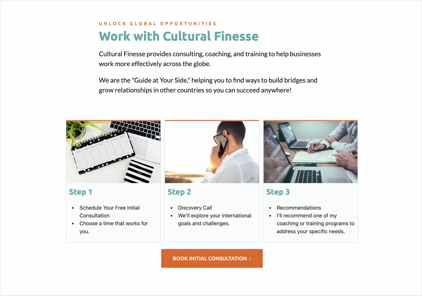
The "work with cultural finesse" section on the homepage helps prospects understand precisely how the process will unfold once they book a free consultation.
Cultural Finesse makes it straightforward for people who are ready to move forward. All they have to do is contact Cultural Finesse using their preferred contact method.
Functional
The website is optimized for mobile devices, loads quickly, and is simple to navigate. Buttons link to appropriate actions, and the site appears to be error-free!
Marketing strategy
Cultural Finesse primarily markets the company through direct outreach. The owner calls or emails prospects and directs them to the website for more detailed information.
As you can see from our examples of effective websites, there's no "one-size-fits-all" approach. However, if you start by prioritizing the needs of your ideal customer, you'll be off to a good start.
Be sure to communicate the benefits of your products and services, include a clear call-to-action, and content to attract, engage, and convert your ideal customer. Ensure that your website loads quickly, works well on mobile devices, and is error-free.
Once your website launches, support it with a quality marketing strategy. Even the best-designed websites won't be effective without marketing!
Free workbook: Win customers with your website!
Create a strategy to get more leads and sales from your website.


