The essentials of an effective website homepage
Jessica Baldwin / Updated January 5, 2023
Your homepage is the first thing visitors see when they visit your website. It's often the first impression that potential customers get of your brand. If your homepage doesn't grab their attention, then they're unlikely to stick around long enough to find out what else you offer.
Your homepage should tell people who you are, what you do, how you can help them, and what makes you different from other companies. It should help convert visitors into leads and sales.
It's not just about the design. You might be thinking, "my homepage has to look amazing!" While an attractive design is important, it's not the only thing that matters when creating a great website.
Your homepage is a prime example where "substance is key." What you communicate to your audience and how you organize information to tell your story is essential to an effective homepage. The design should complement your content. Not the other way around.
Below are the essential elements of a successful homepage design.
Two prerequisites for an effective homepage
Before you can begin thinking about your homepage, you have to complete a couple of prerequisites.
1) Define your ideal customer
An effective website has to speak to your ideal customer. If you haven't defined your ideal customer, now is the time to do so.
How do you define your ideal customer?
Suppose you have a business that has been operating for a while. In that case, you'll want to analyze your existing customer base to find similarities and patterns among the people within your list.
If you're just getting started in your business, your ideal customer will start with who you think will most resonate with your product or service. If you've done some market research to define your target audience, you can start there.
But, you'll want to drill down on the target audience a bit deeper. When defining an ideal customer, imagine a single person representing someone who would be the perfect customer. What do they think? How do they feel? What problems are they trying to solve?
A simple tactic to think about your ideal customer is to complete this simple fill in the blank statement from their perspective:
"As a [type of person], I want [some goal], so that [some reason]."
You want to complete this statement from their perspective and in a way that relates to your business.
For example, one health coach might fill in their ideal customer statement like this:
"As a busy working parent, I find it challenging to find time for fitness, but I want to feel fit and healthy so that I have more energy to play with my kids after work."
Defining your ideal customer will make it easier to plan your website around their needs.
2) Set your website goals
What are the goals of your website? "Duh, to get customers!" you might say.
Yes, the primary goal of your website is to help you get customers. But that's oversimplifying things a bit.
Your website needs to:
- engage your ideal customer
- educate them about your products and services
- drive some percentage of them to convert
How you achieve these goals will be specific to your business. Learn more about setting your website goals.
The essential elements of a website homepage
Below, we'll cover the general framework for an effective homepage. Remember, however, that this is just a framework. Every website is unique to its business and corresponding goals.
Homepage hero
The hero section of your homepage is the section that is immediately viewable before someone scrolls down the page. Your hero section should be visually appealing and should quickly communicate the value that you offer the viewer.
Critical elements of the hero section include your key benefit statement, support copy, call to action, and an attractive visual.
Let's look at each of these elements in more detail and review hero section example below.
Key benefit statement
Why is your business the best choice for your ideal customer?
Think back to your ideal customer statement. You've defined the type of person you're speaking to, what they want to achieve, and the reason behind it. Now, write your key benefit statement to address their needs and describe how you can uniquely help them.
A good key benefit statement within your hero section will resonate with your audience and motivate them to stay on your website to learn more.
Support copy
You may need additional copy to support your key benefit statement and explain how your business helps your customers. Feel free to add a couple of short sentences to enhance the reader's understanding of how you can help them.
Call to action
What do you want your website visitor to do? This is going to be different for every website. You may want your visitor to call you, request a quote, purchase a product, sign up for your course, subscribe to your newsletter or podcast, or any other number of things. It's necessary to pick one action as your priority.
You should plan your homepage and the rest of your website around helping your website visitor take this action.
Attractive hero image
Your hero section's visual should attract the attention of your ideal customer.
Use video, photography, or illustrations to enhance your website's hero. The format is far less important than the substance of the visual. You want to choose imagery that your ideal customer will resonate with and that suits your brand image.
Social Proof
Include customer testimonials, media mentions, or social media followers to help build trust and credibility with your website visitors.
Homepage hero example
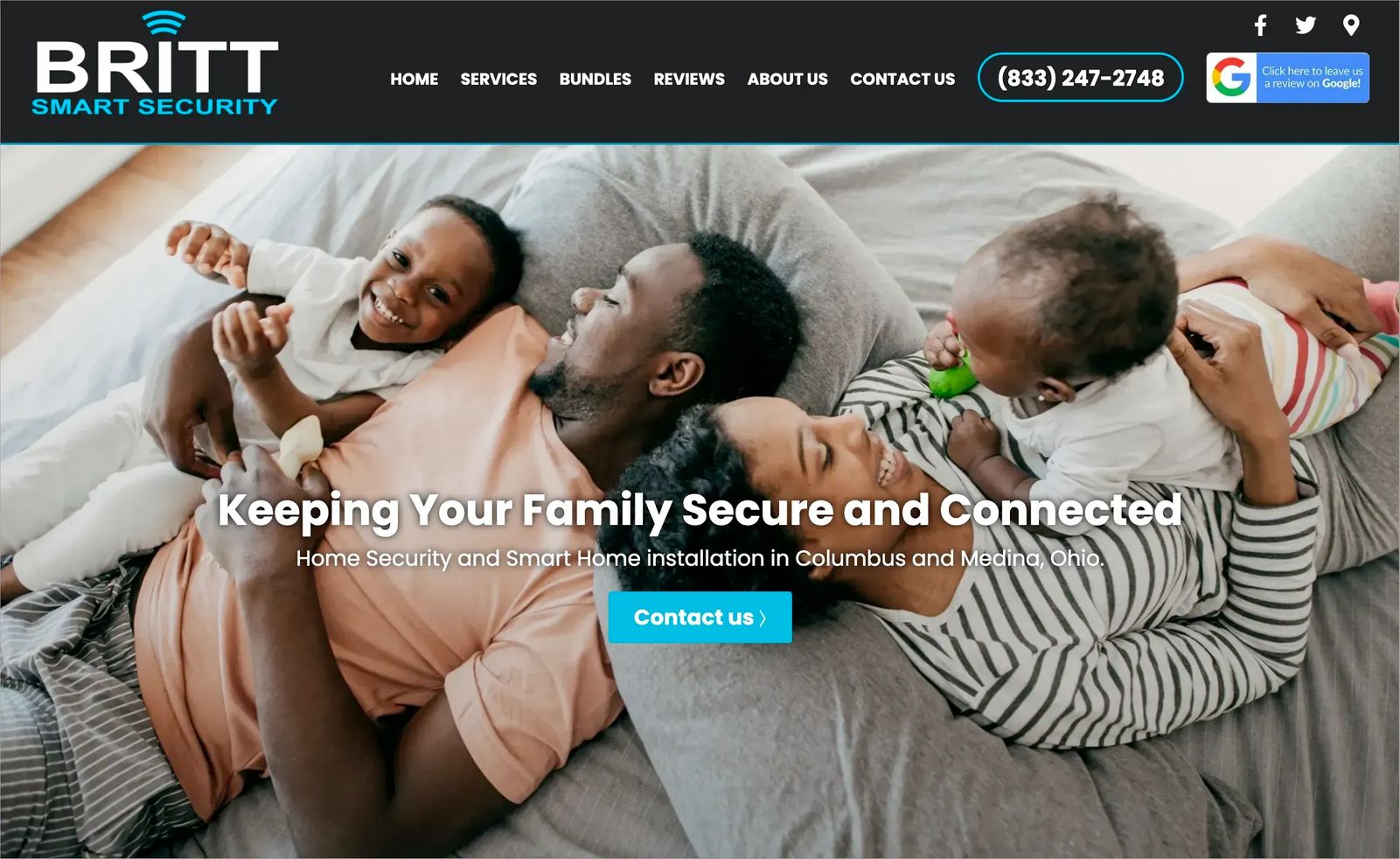
Let's look at the homepage hero for Britt Smart Security. Instantly, the website visitor will notice the adorable family photo. The key benefit statement says, "Keeping your family secure and connected." The family image is paired with copy that talks about families. We instantly know who the ideal customer is for this business.
The supporting copy says, "Home Security and Smart Home installation in Columbus and Medina, Ohio," which helps geographically define the customers that Britt can help.
The call to action is easy immediately visible as a button within the hero and the phone number is visibile in the menu.
Now, Britt Smart Security is not excluding single people who want to keep their homes secure and connected. However, the business knows that families are most motivated to hire the company for new home security and smart home installation, so they've catered the website to them.
How to strategize the hero section for e-commerce
What if you run an e-commerce business? Your hero section might be a bit different than what we described above. In that case, you may choose to feature products in the hero section. Your goal is to get visitors to add products to their cart and checkout to make a purchase. In that case, it would make sense to feature products you believe your ideal customer would love towards the top of your site. Your most popular products or new arrivals would make sense here.
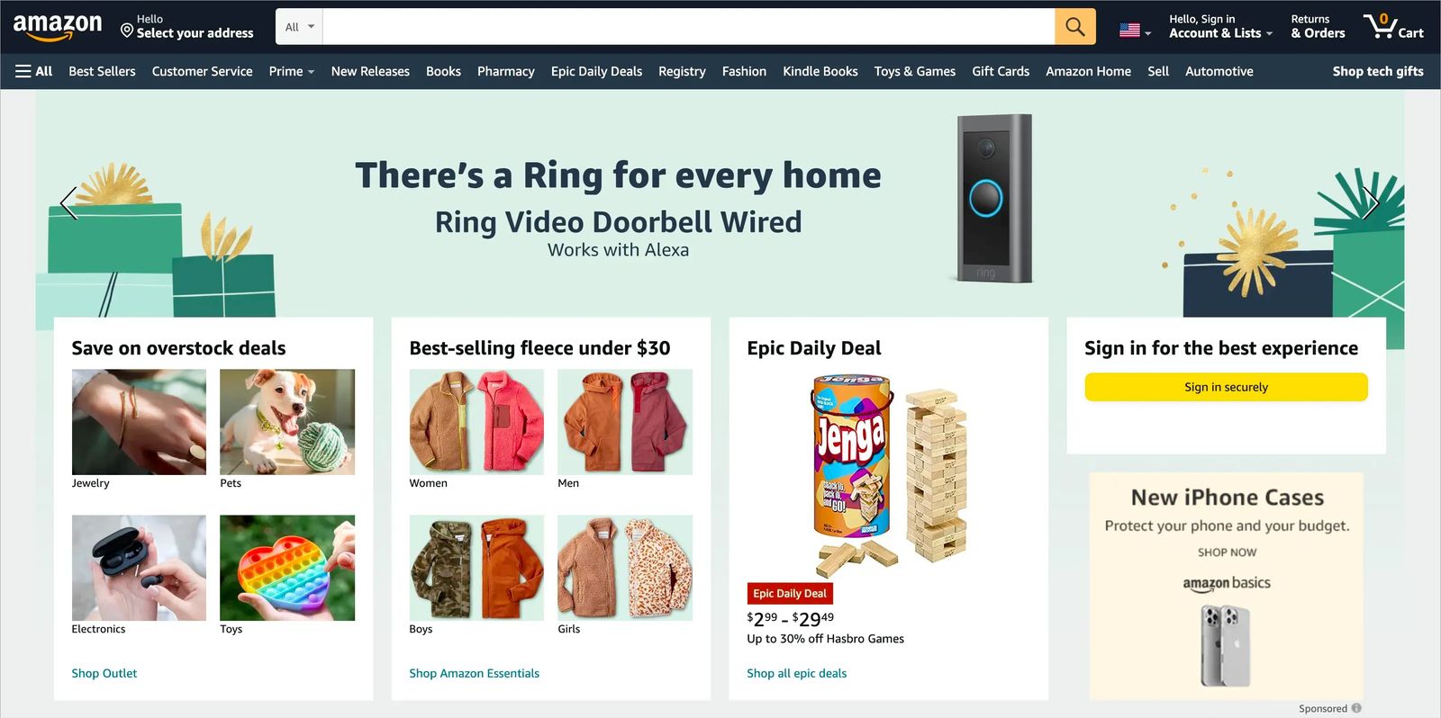
Take a look at the world's biggest retailer, Amazon. When you hit the Amazon.com homepage, you instantly see featured products. If you're signed in, then you see products based on your browsing history.
Of course, Amazon's website has millions of dollars of technology behind it. However, you can implement similar strategies on your e-commerce website. Showcasing popular products at the top of your homepage is one tactic you can easily use.
How to organize the hero section for content-focused businesses
Online publishers, podcasters, and bloggers may have different goals for their websites, as well. For content creators, the goal may be to keep the audience engaged with their content as long as possible. That way, their audience is more likely to see advertisements on their website and subscribe for more content.
Therefore, creators may want their website's hero section to feature popular content to move the audience to read more.
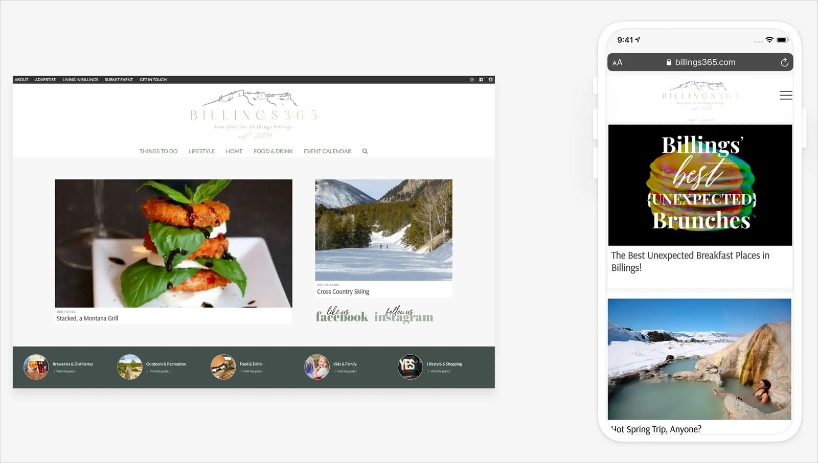
Billings365.com is a website for "things to do in Billings, MT." The local entertainment publisher features a calendar of events and blogs about recreation, dining, shopping, and more things to do around town.
Billings365 generates revenue from sponsored content and advertisers, so its audience must see the ads on its website. Therefore, Billings365's hero section leads with relevant, engaging content.
Billings365 knows that if someone clicks in to read an article, they will stay on the website longer and are more likely to see their partners' ads.
What to include after the hero section
Your hero section should grab your visitor's attention and entice them to dig deeper into your website. It's common for visitors to continue scrolling down the homepage if they want to know more. So, what should come after the hero section?
Now, it's time to prioritize the order of your information. Think about your ideal customer and what is most important to them. Plan the sequence of homepage information accordingly.
Do they need reassurance that you're a reputable company? Then, perhaps testimonials should come next.
Do you need to showcase your authority and build a relationship with your prospects? Then, popular content and free resources might be the next most important thing.
Many websites will have an expanded description of featured products or services after the hero.
However, it won't be the same for every website. Structure the content hierarchy around the needs of your ideal customer. You should also take into consideration your customer's journey.
- What are the steps your prospects take?
- What pieces of information do they need to consume before becoming a customer?
- In what order do they need to consume that information?
You'll need to make these considerations to determine what should be on your homepage and in what order.
Homepage sections
Below are a few common content sections to consider for your homepage. You shouldn't include all of these sections, only those necessary to communicate your value to your ideal customer. Similarly, there may be sections unique to your business and essential to communicating your value that we haven't included.
Use these suggestions to begin your planning. Add to your homepage as needed.
Differentiator
What makes your business different (and better) than your prospect's alternatives? It can be helpful to call out your competition and discuss why your product or service is the best choice to solve their problem or to meet their needs.
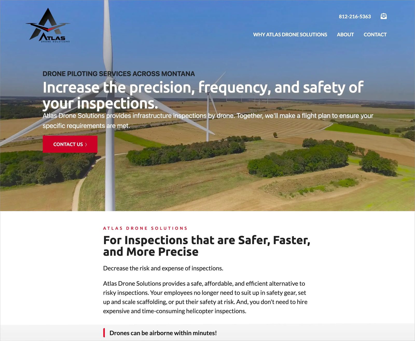
Atlas Drone Solutions does a great job of this within the section following its hero. The business says "for inspections that are safer, faster, and more precise." The support copy in this section recognizes the customers alternatives–unsafe scaffolding or expensive helicopters–and how Atlas Drone Solutions is a superior alternative to those other options.
Featured products and services
Your hero section communicates the value you provide to your ideal customer. The featured products and services section tells them precisely what you offer.
An accountant, for example, could showcase information on bookkeeping and tax preparation services.
An e-commerce retailer focused on women's fashion might include popular categories like jeans, tops, and accessories or feature new inventory.
A life coach may want to draw attention to their free Facebook group, one-on-one sessions, and self-guided course.
This section needs to be informational and graphically appealing. It should identify your primary products and services and encourage the website visitor to click through to learn more about each one.
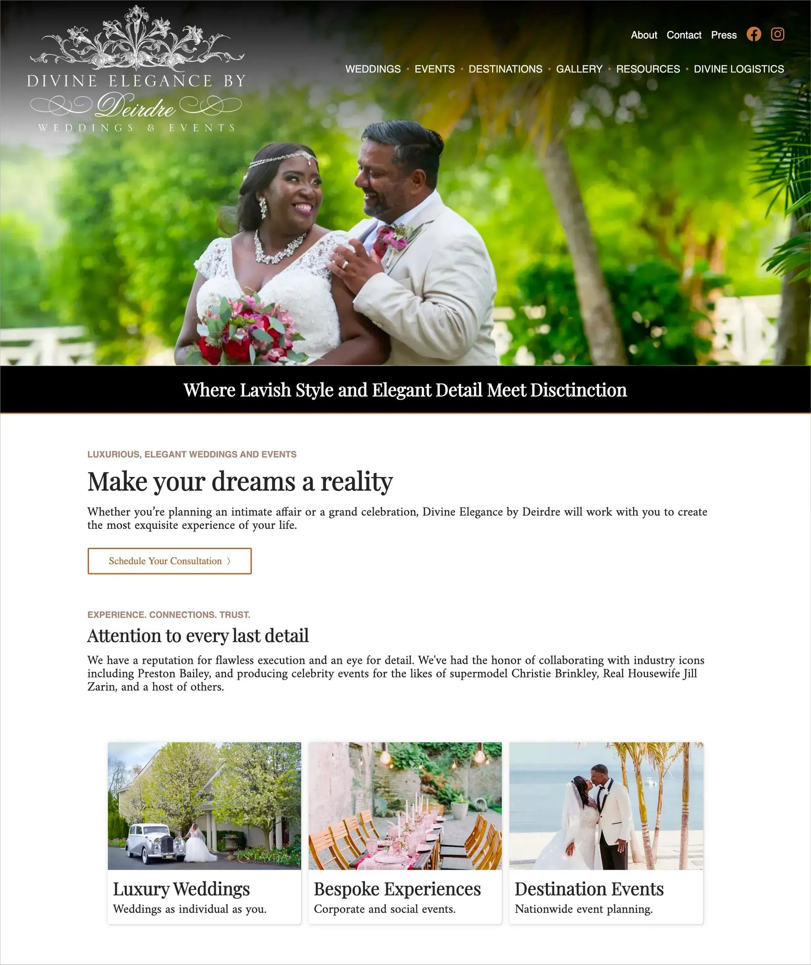
On Divine Elegance by Deirdre's website, the business brings attention to its three main areas of event expertise–luxury weddings, bespoke events, and destination weddings.
Customer Testimonials
Customer and client testimonials provide social proof on your website. They help to communicate your business's key benefit statement through words from your existing customers.
Testimonials and reviews tell your website visitors that "this person who is like you, bought this product (or service) and got tremendous value from it."
Reassure your prospects that you're a reputable person or organization.
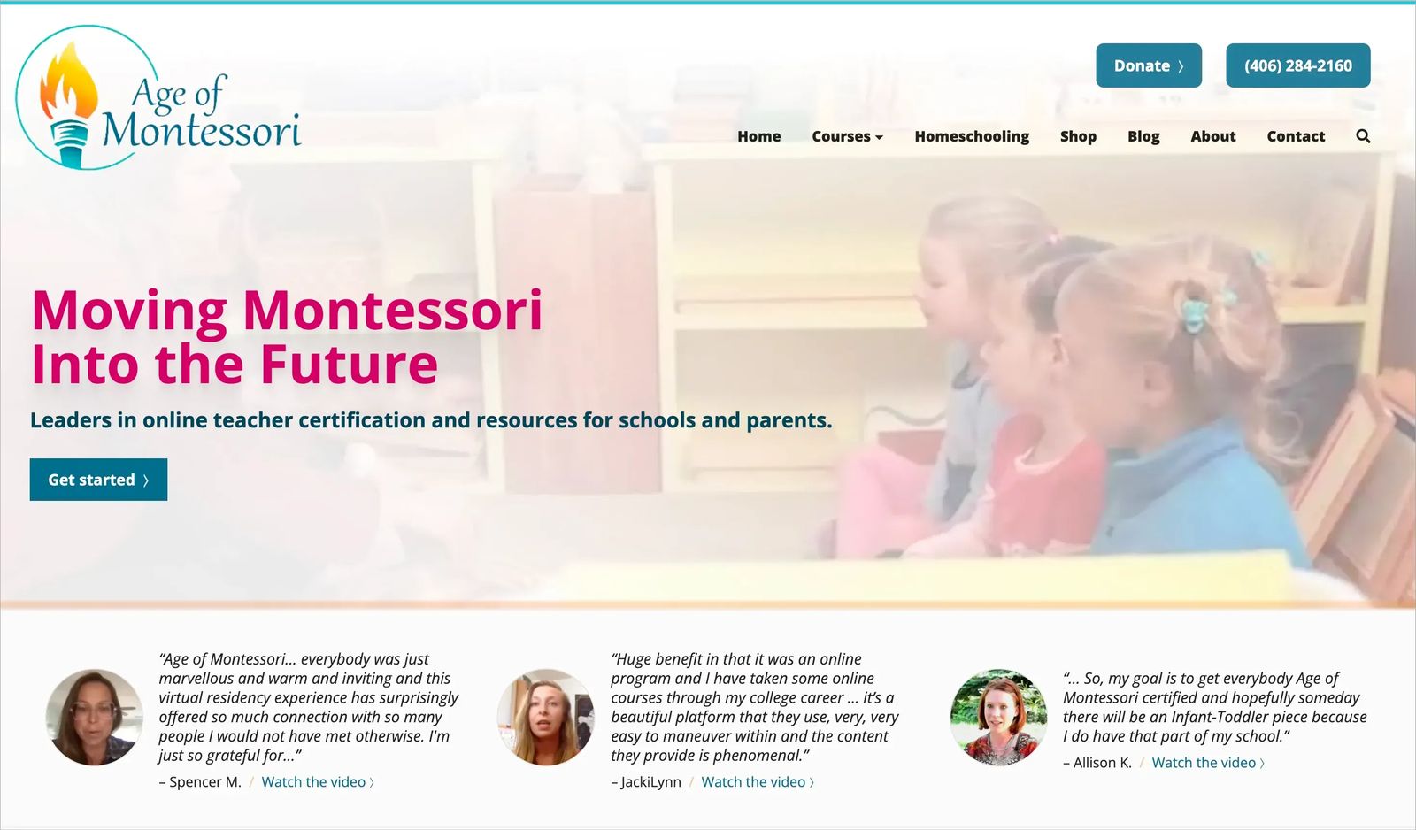
On Age of Montessori's website, current and past students describe their experiences with the organization.
Features
Software, online courses, and novel products often need an expanded explanation of important features. Walk your website visitors through the many benefits they will gain from key features of your product or service.
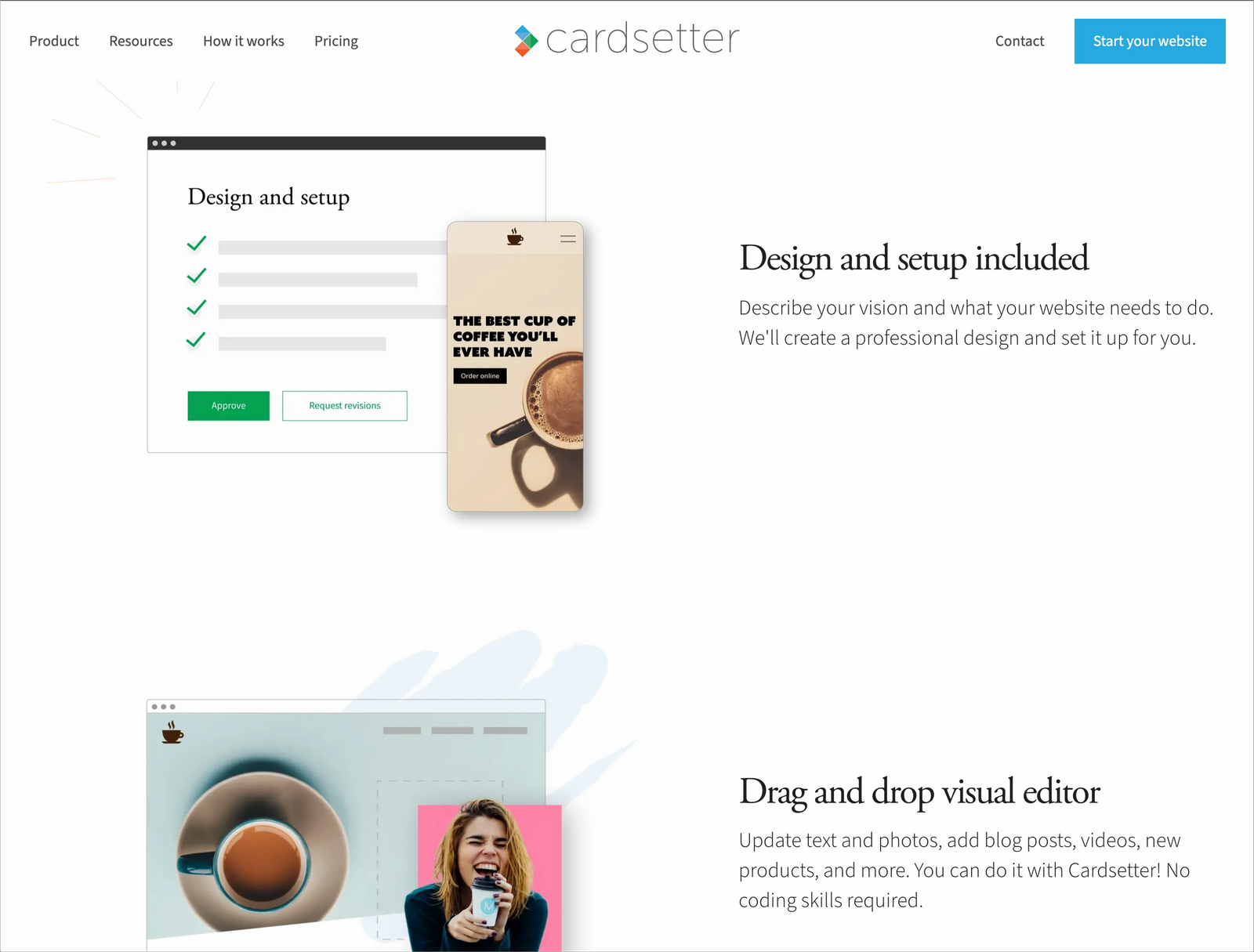
For example, you'll notice the features and benefits highlighted on cardsetter.com as you scroll through the homepage.
About
An about section can be a helpful addition to your homepage. About sections are especially valuable on the homepage of service-based businesses, info products, courses, content, or any business that relies on the power of a personal brand or the organization's reputation.
Your prospect may need to know more about you and your business to build trust before they are going to convert.
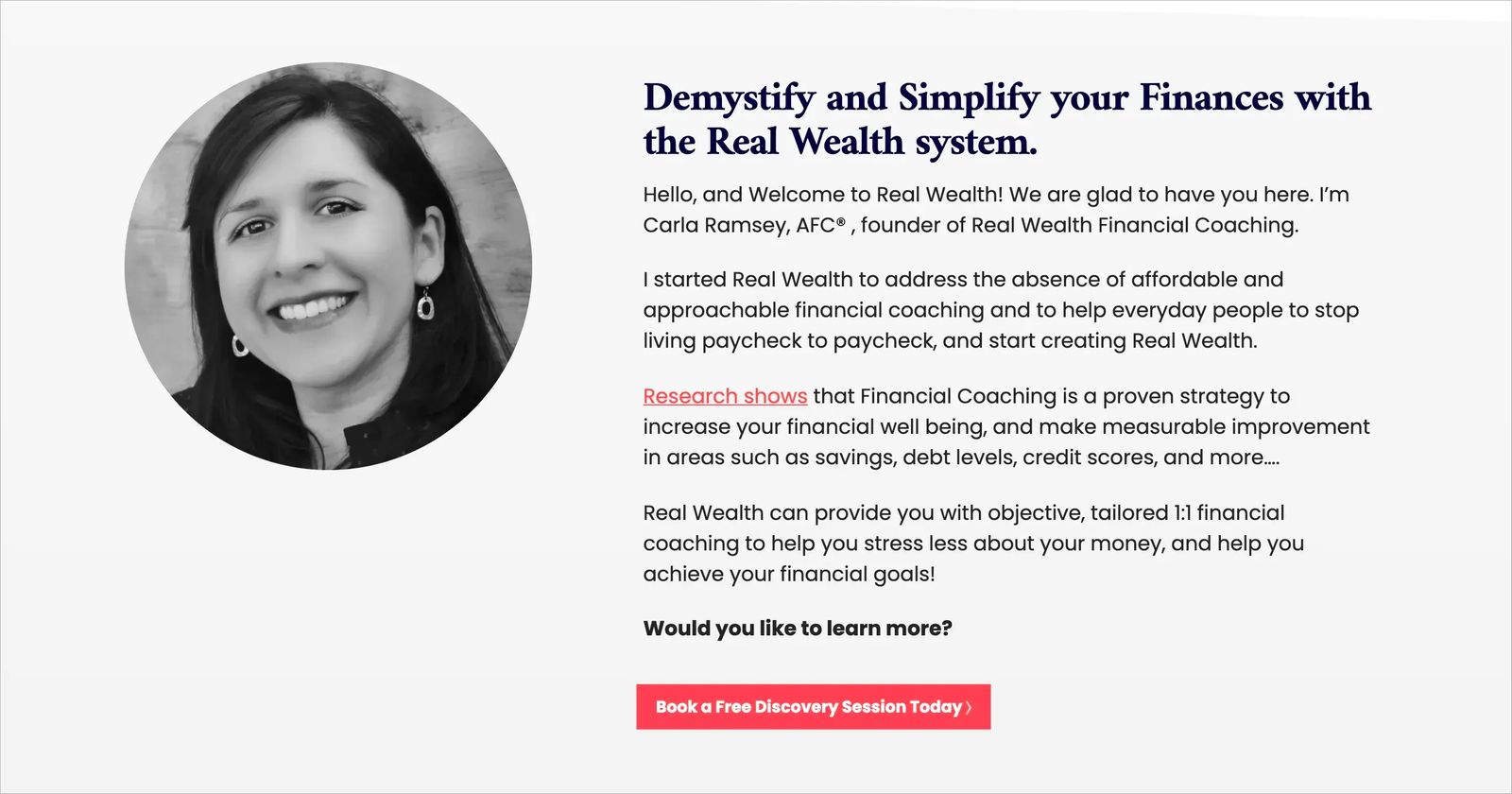
On the Real Wealth Financial Coaching website, the business owner, Carla Ramsey provides an overview of her background and the benefits of her financial coaching services.
Lead capture
Often, website visitors aren't immediately ready to convert on your main product or service. That's why many website owners offer a resource, content, discount code, or initial service for free in exchange for a prospect's email address.
On e-commerce websites, this will often be a coupon for the customer's first purchase. Other businesses may include e-books, worksheets, white papers, or encourage visitors to sign up for their newsletter.
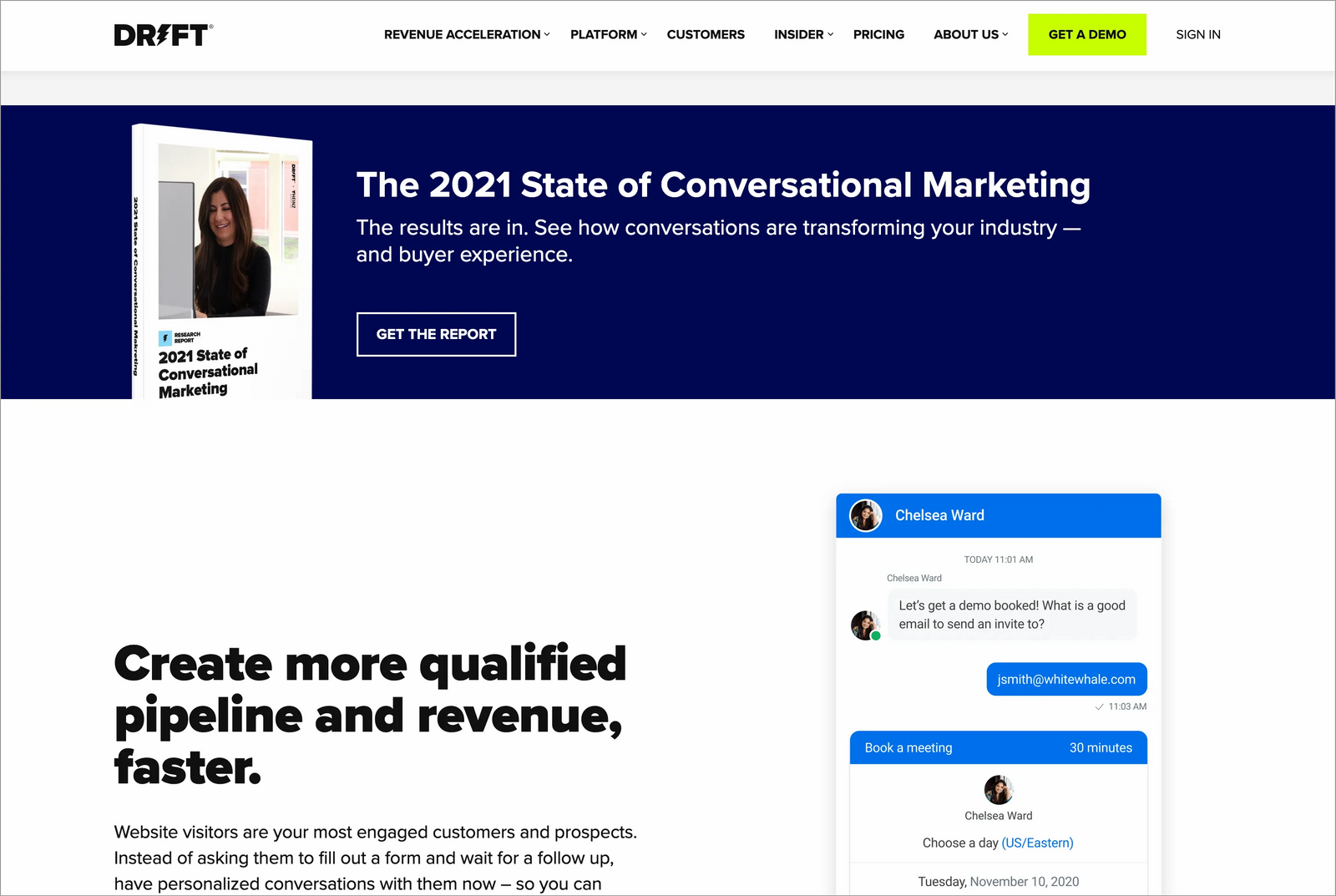
The homepage for chat software company, Drift, features a report that visitors can download after providing their email address.
Resources
You can help build authority in your industry by providing helpful content to your ideal customer. Above, we discussed providing content behind a lead capture form. However, some of your website visitors won't be ready to give their email until they trust that you are a reliable source of information.
Grow trust by providing quality content. Blogs, videos, photo galleries, podcast episodes, and infographics can help engage your website visitors and keep them on your website longer. The more time a prospect spends with your brand, the closer they are to becoming a customer.
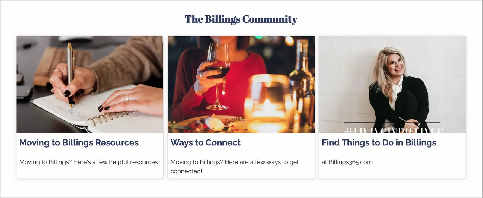
Real estate broker, Liz Francis provides new homeowners with information about the local community. It includes practical info like how to hook up utilities along with entertainment and social connection resources.
Photos
For some businesses, photos of the company or individual's work are essential in the customer's sales journey. Examples of these businesses include home builders and contractors, graphic artists, photographers, wedding planners, florists, cosmetologists, and more.
Capture your website visitor's attention with images that showcase the quality of service they can expect from you.
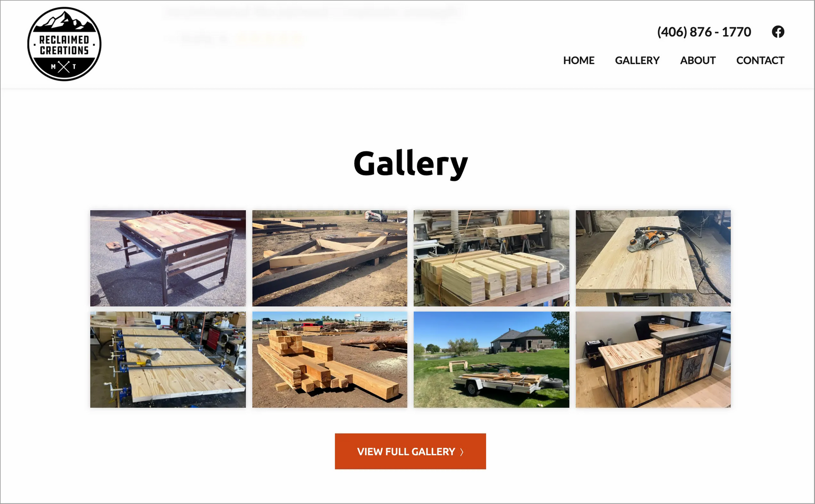
Reclaimed Creations creates custom artwork and furnitures for its clients. The company includes a photo gallery of their work on the homepage.
Case Studies
Testimonials and reviews provide social proof on your homepage. Expanded case studies can go further to describe how you helped your customers achieve their desired outcomes.
For example, a health coach may include a case study with one of their clients that talks through each program stage with the client and documents the results achieved.
An optometry business may showcase the story of a young child, nervous about wearing glasses, and how the business's staff helped them find the perfect pair!
Social proof is a powerful tool to help convince people to buy your product or service. You can use testimonials and case studies to do this.
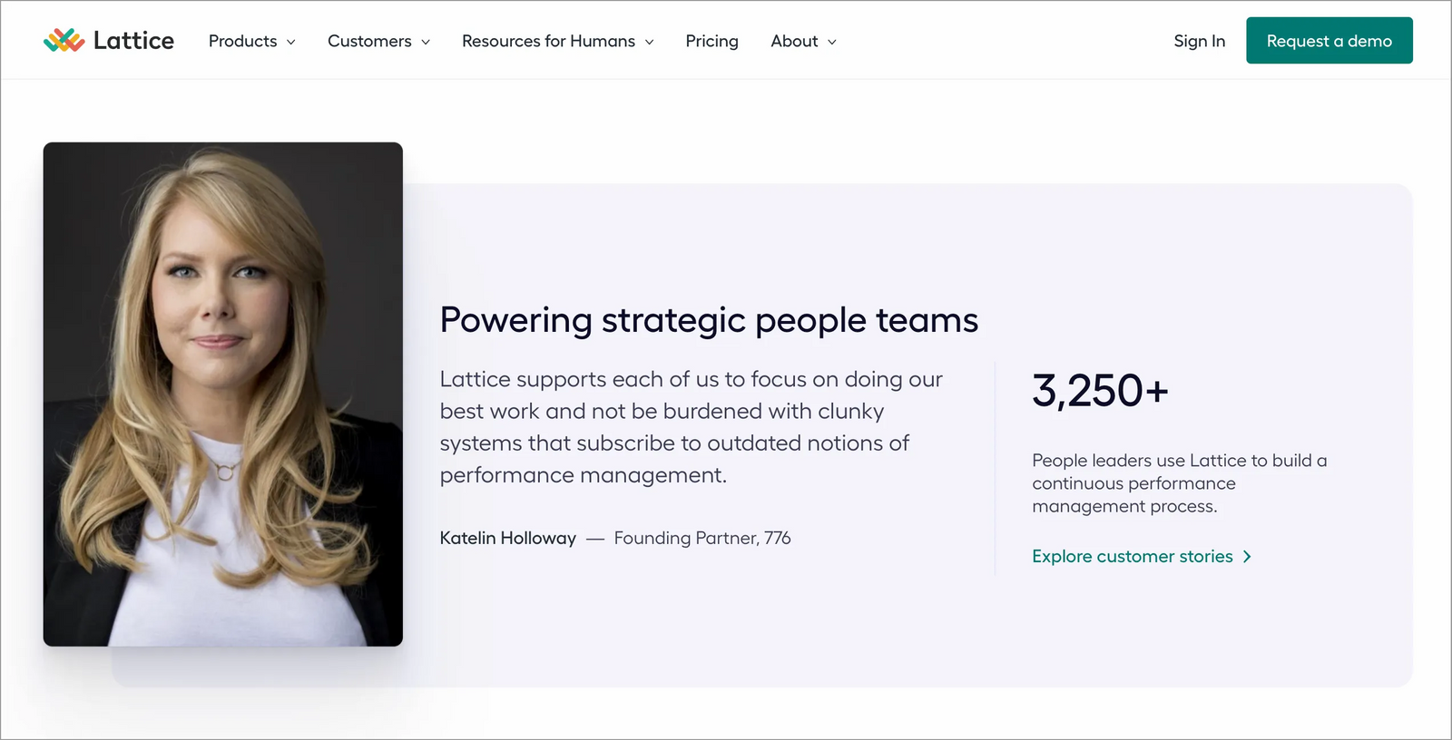
HR software, Lattice prominently features customer testimonials on their homepage that encourage visitors to dig deeper into relevant case studies.
How it works
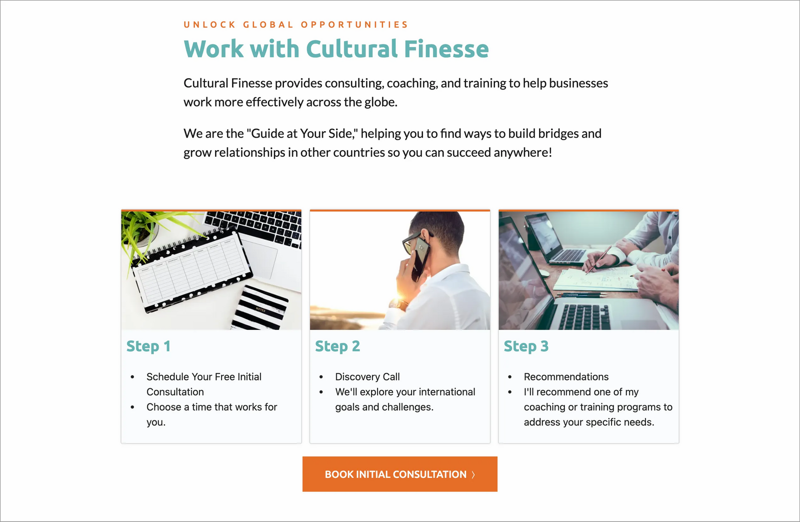
Including a "how it works" section on your homepage can be advantageous for many websites. Telling your website visitors the exact steps to working with you can help remove ambiguity, making them more likely to take the first step.
For example, an accountant's process may start with potential clients booking an initial consultation on their calendar. Then, the consultation takes place where the accountant learns more about the prospect's needs. After that, the potential client receives a proposal, and services can begin.
Spelling out these three steps on the homepage gives the visitor a clear understanding of what to expect from the business.
Business coach, Cultural Finesse, tells prospects the exact process to get started with a customized coaching program.
Each homepage is unique to the business it represents. The most important thing to do when planning your homepage is to consider your ideal customer and the journey they will take to becoming your client or customer. Prioritize your homepage content with these two things in mind.
Get your free website planner.
Getting organized is the first step to website success.
